bootstrap-datepicker
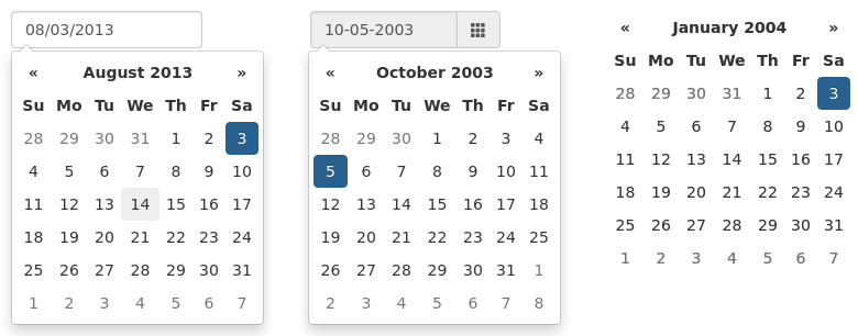
Bootstrap-datepicker provides a flexible datepicker widget in the Bootstrap style.

Versions are incremented according to semver.
Requirements
These are the specific versions bootstrap-datepicker is tested against (js files) and built against (css files). Use other versions at your own risk.
Dependencies
Requires bootstrap’s dropdown component (dropdowns.less) for some styles, and bootstrap’s sprites (sprites.less and associated images) for arrows.
A standalone .css file (including necessary dropdown styles and alternative, text-based arrows) can be generated by running build/build_standalone.less through the lessc compiler:
$ lessc build/build_standalone.less datepicker.css
Usage
Call the datepicker via javascript:
$('.datepicker').datepicker();
Data API
As with bootstrap’s own plugins, datepicker provides a data-api that can be used to instantiate datepickers without the need for custom javascript. For most datepickers, simply set data-provide="datepicker" on the element you want to initialize, and it will be intialized lazily, in true bootstrap fashion. For inline datepickers, use data-provide="datepicker-inline"; these will be immediately initialized on page load, and cannot be lazily loaded.
<input data-provide="datepicker">
Markup with component
<div class="input-group date" data-provide="datepicker">
    <input type="text" class="form-control">
    <div class="input-group-addon">
        <span class="glyphicon glyphicon-th"></span>
    </div>
</div>
You can disable datepicker’s data-api in the same way as you would disable other bootstrap plugins:
$(document).off('.datepicker.data-api');
Configuration
Options are passed to the datepicker function via an options hash at instantiation:
$('.datepicker').datepicker({
    format: 'mm/dd/yyyy',
    startDate: '-3d'
});
Most options may be provided as data-attributes on the target element:
<input class="datepicker" data-date-format="mm/dd/yyyy">
$('.datepicker').datepicker({
    startDate: '-3d'
});
Defaults for all options can be modified directly by changing values in the $.fn.datepicker.defaults hash:
$.fn.datepicker.defaults.format = "mm/dd/yyyy";
$('.datepicker').datepicker({
    startDate: '-3d'
});
Stylesheets
There are a few different stylesheets included in the library. This is an overview of what each file is to be used for:
bootstrap-datepicker.css gives legacy support for twitter bootstrap v2, bootstrap-datepicker3.css is used for twitter bootstrap v3 support
and bootstrap-datepicker.standalone.css can be used to include the datepicker without depending on the twitter bootstrap library.
No Conflict mode
$.fn.datepicker.noConflict provides a way to avoid conflict with other jQuery datepicker plugins:
var datepicker = $.fn.datepicker.noConflict(); // return $.fn.datepicker to previously assigned value
$.fn.bootstrapDP = datepicker;                 // give $().bootstrapDP the bootstrap-datepicker functionality
Table of Contents
- Markup
- Options
- autoclose
- assumeNearbyYear
- beforeShowDay
- beforeShowMonth
- beforeShowYear
- beforeShowDecade
- beforeShowCentury
- calendarWeeks
- clearBtn
- container
- datesDisabled
- daysOfWeekDisabled
- daysOfWeekHighlighted
- defaultViewDate
- disableTouchKeyboard
- enableOnReadonly
- endDate
- forceParse
- format
- immediateUpdates
- inputs
- keepEmptyValues
- keyboardNavigation
- language
- maxViewMode
- minViewMode
- multidate
- multidateSeparator
- orientation
- showOnFocus
- startDate
- startView
- templates
- showWeekDays
- title
- todayBtn
- todayHighlight
- toggleActive
- updateViewDate
- weekStart
- zIndexOffset
- Quick reference
- Methods
- Events
- Keyboard support
- I18N